


On my Artboard — New Branding: &hope executive coaching
A deep dive in how Anders Design created a new brand and visual identity for &hope executive coaching — with tips ad tricks for your business!

Hi there!
Welcome to a new smaller series: On my Artboard! This is where I share behind-the-scenes insights from my recent design projects and show how brands come to life in the real world. Hopefully, it'll spark some ideas or help you think differently about your own business!
This time, I'm diving into the brand rebrand I created for my incredibly talented friend and executive coach, Beth Hope of &hope.

Beth started her coaching business 8 years ago after years in events and HR. When she decided to take the entrepreneurial leap, me and one of her other close friends (Love you Louise!) quickly crafted her first brand to get her business off the ground. *Abracadabra* there it was! She had a personal, smart, authentic brand that served her beautifully.
Fast forward to last year. &hope had grown significantly, the business had evolved, and Beth wanted her brand to feel more sophisticated. She didn't need a completely new brand - she needed her brand to grow up alongside her business.
The brief was clear: create a brand that resonates with ambitious senior leaders while standing out from the sea of generic coaching brands.

Step 1 — Figuring out who &hope is — Brand Strategy
Before touching any design software, we dove deep into strategy. Since Beth's business had evolved over the years, we needed to ensure her new brand perfectly aligned with where she was heading.
1. Research phase — Figuring out who your competition is
When doing brand strategy, most people do look at what competitors are doing and do good research themselves, however often you look to closely and don’t expand your view to competition who’s not directly next to you. For &hope, we not only looked at other coaches but also at the large premium consulting firms, the executive agencies and the high-end professional organisations her clients already work with.
Tip: If you know which companies you want to work with, study the other service providers they trust and examine their visual brands as well. Always research a broader competitor landscape than you think, not just the companies closest to you or in the same industry.
2. Developing &hope’s strategy — Finding that differentiator
Through our strategy sessions, we identified what makes &hope different: authentic, transformative coaching that builds lasting confidence and resilience. Not just another motivational coach but a strategic partner for sustainable leadership growth with the credentials to back the work.
The 3 brand pillars we landed on:
Clarity: Bringing focus to goals and values
Confidence: Building skills and self-assurance
Sustainable Growth: Long-term transformation over quick fixes — building a lasting connection and partnership

3. Visual identity is taking shape — Breaking away from the rest
After doing all of this research, we pulled all of the competitor logos together and compared them visually next to each other to see if there were any commonalities. And like any industry, people tend to stick to the same design choices, making it harder to differentiate. The analysis showed that many coaching brands follow the same playbook: neutral colours (lots of navy and grey), clean sans-serif fonts, and minimal design. Safe, but unremarkable and forgettable.
What we could do to stand out from the competition: Use bold colours and distinctive typography while maintaining the sophistication senior executives expect. Plus, create an actual logomark - something most coaching brands completely skip.

Tip: Sometimes the biggest risk is playing it too safe — sounds cliché right? But it’s true. When looking at the visual style of your competition, there will be clear patterns emerging. Instead of following the herd, make your brand stand out so it’s memorable enough. That way, your clients will remember you weeks after they see your brand.
Step 2 — Designing a new brand identity — Turning strategy into design
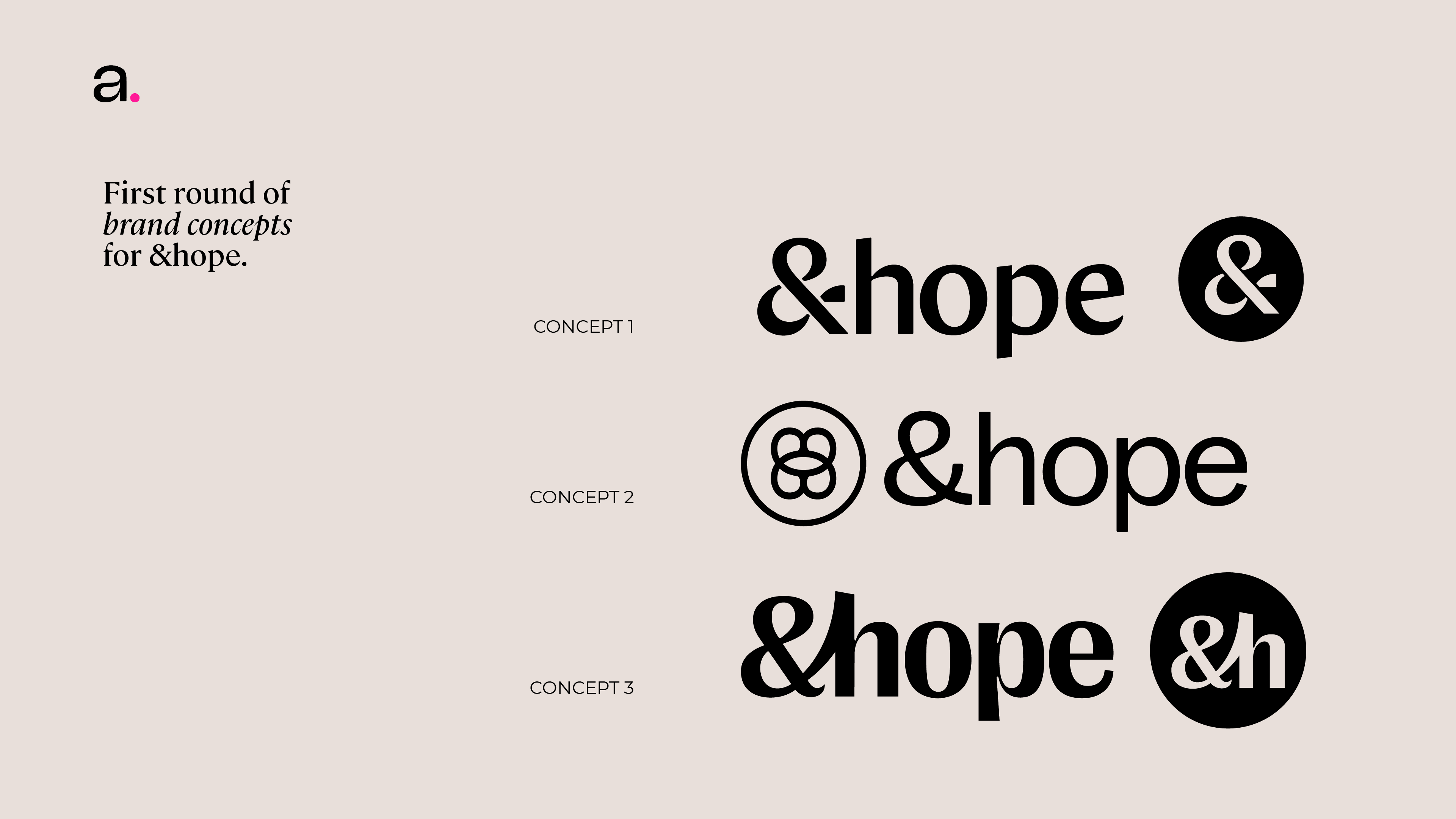
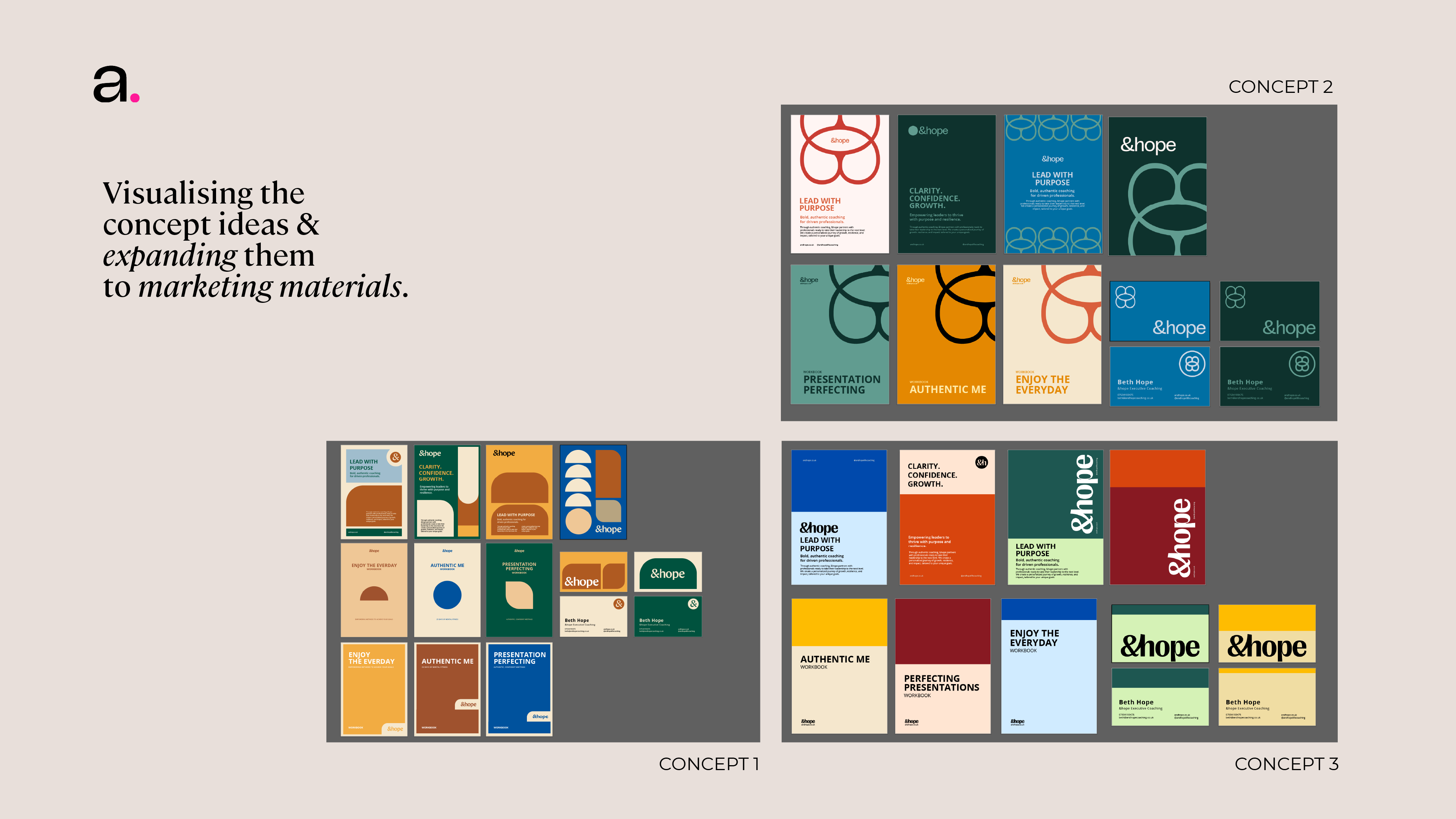
After Brand Strategy, we get to work on designing — for &hope we presented 3 concept ideas:
Bridging the gaps
Growth through collaboration
Making brain waves
The logo
For each concept, we created three different logos, typography, and colour palettes, along with visual elements to accompany the concepts. I wanted to give Beth options!
Looking at the brand name, it was clear that a lot of fun things could be done with the ’&’ - giving the brand a lot of versatility and making it stand out as well. During our strategy session, I found that many coaching brands are text-based, so having a visual distinction would immediately set Hope apart and make it more memorable.
After talking to Beth, I realised that the biggest thing she does with her clients is help them fill in the gaps or create “bridges” through her partnership. And this key idea was what I wanted to convey through the logo and logomark. In one concept, there are clear gaps between the swishes of the ampersand, representing those gaps, or connecting the ‘&’ with the ‘h’ in one smooth curl, which to me represents connection and partnership with &hope.
For the logomark, the "&" symbol became a key brand element; we made it the hero of the brand. It takes something that could be considered awkward (the & in the name) that you’d usually hide in small text, and we made it a confident and the strongest brand point, allowing for instant recognition. It’s bold, memorable and confident.
Two versions of the logomark use the ‘&h’ as the main logomark, but one features a more abstract and visually appealing logomark. The idea behind this concept is that by working with &hope you’re changing your thinking, you’re making different connections in your brain. Yeah, that’s what it is: a very very abstract brain (and a sideways butterfly to represent metamorphosis and change)
Enjoy 14 mins of me trying to figure out this logo (lol)
Tip: The importance of having different logos. Now you might be thinking: “Eva, is one logo not enough? I could use that everywhere no?” Well yes, but also no. Let’s say you have a really long name, it will be REALLY HARD to use that as a favicon (the logo that’s on your million tabs), because scaled at such a small version you won’t even be able to see what it says. Having a responsive logo shows your brand means business and you have thought about everything. Having an outlined version, a filled version, different sizes and scales means your brand works everywhere from business cards to websites to large scale presentations.
Typography
Finding the right typography is a job in itself and can sometimes take days to find the exact right one for your brand. Do you go modern or classic? Serif or a sans-serif? Mono-weight or script? There are a lot of typefaces out there and it’s hard to pick one. my golden rule is to at least have 2 different versions to give you a versatile type package to play with. What I am less fussed about is you reusing the same typeface as used in your logo — honestly that really doesn’t get noticed that much (except maybe by other designers).
For &hope the personality in the type was crucial, we wanted to avoid the “Your local aunt who is a coach” script font while also steering away from the “it all looks the same and cold corporate consultant” sterile look. I wanted professional, but approachable - exactly what senior executives are looking for in a coach.
I wanted to find a modern typeface — so a sans-serif, that still had some personality — definitely not a mono-weight type, I wanted some differences in the stroke weight of the letter — and some subtle elegance — a modern interpretation of the feet of a serif font helped with that. So I went for a more professional and elegant display typeface for titles and subtitles, but a more modern and down to earth simple typeface for any body text.

Colour Palette
Now for colour palettes - another beast in brand design. Beth of &hope creates a lot of marketing materials, so I wanted to give her a color palette she can use across all touchpoints and materials to create clear differentiation. I love colour, however I do understand that the professional business world has not caught up yet and still sticks to their classic blue tones (which keeping in mind colour psychology, does make sense, but that is an elaboration for another time). How do you balance that professionalism with some personality? I created a palette that felt energetic, still kept in line with the sophistication and business world, but also gave her some more vibrant colors to play with in other circumstances.
The blue feels premium and trustworthy
The yellow/amber adds energy
The red gives warmth
The deep rich teal adds sophistication — professional enough for boardrooms, distinctive enough to be memorable and more fun than the same old blue everyone else uses.
Every colour also has 2 different lighter hues, to give &hope flexibility to use these colours together and create various designs.
The palette works great, because it is professional for corporate settings, but also distinctive enough and doesn’t blend in with the rest of the competition, which typically uses black/white, navy/grey colours.
Tip: Don't let "professional" mean "boring." The right colour strategy can differentiate you while still feeling appropriate for your industry.

Visual Language
When creating brand concepts, I like to include visual elements as well to create a complete picture. As Beth gives numerous presentations and produces a large number of workbooks, I wanted to provide her with a visual language system that she can use herself. When she expands her products, I can create the visuals for her materials. However, when I don’t have the capacity, she can use a simple system to do it herself, allowing her to keep moving forward without waiting for me.
Keeping this in mind, I used simple geometric shapes as her flexible visual system. It gives &hope:
consistency across all of her materials,
Flexibility to differentiate products and services,
Adding some visual interest without being childish or gimmicky,
Scalability for any future expansions.
Step 3 — Finalising, tweaking and more edits — Creating the final brand
Contrary to what some designers on the interwebs might tell you, clients rarely sign off after round one. With &hope this wasn’t any different - she loved one concept, but wanted to see it pushed a bit more, which is what I did.
I presented the new versions, and it was exactly what she was looking for. I got sign off and we polished everything off, exported all of the files for her in different sizes, formats, etc and handed her all of her assets + a guide on how to use her new brand.
The results? Beth feels "finally aligned" between her expertise and her brand. The new identity gives her confidence to pursue higher-level corporate partnerships and premium individual clients. Most importantly, the rebrand positions &hope for growth into new markets, particularly the international executive coaching space.
And that, in short (hehe), is how the new &hope brand came to be! Writing it out and reading it like this, it might seem that this is a quick and easy process, but this was a branding process that took several months to get to this point. I talk about why design takes a while here. Good branding isn't fast - it's thorough.
All of the files (logos,colours, type, brand guidelines, brand images etc) we hand over to clients.
A Challenge for Business Owners
Take a critical look at your current brand materials. Ask yourself: Do these make my ideal clients feel confident about working with me? Your brand should never be the reason a potential client chooses someone else.
Not sure if your brand is actually working for your business? I’ll gladly take a look at it and would love to chat to you about it!
Next quarter, I'll be sharing another rebrand story with even more behind-the-scenes insights. Let me know what you think of this format! Would you like to see something else or have any questions for me, reach out. See you next month, or let’s chat on Instagram!
Eva
PS: If you are looking for an executive coach Beth is honestly the best! And she also offers free consultations ;). You can find her on her website, her LinkedIn, Instagram and you can also email her.